
Art Direction
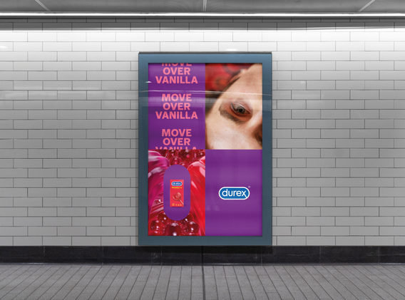
As part of a global rebrand, Durex found a new image, font, and manifesto. With the new custom build Midnight Sans font, the Durex lozenge became a key visual and cropping device to focus in on intimate moments.
In this project, I assisted with the image searching for this rebrand, reflecting a more modern, raw and real brand. The photography was to be with real people (not airbrushed models), in real settings (not a set) and portray real intimacy.

Another part of this project was the new sensory stories to showcase the qualities of each product. I was part of translating the written sensory stories into briefs for the 3D agency, colours and visual references for them to work from.
In the press: DEZEEN, It's Nice that, Creative Bloq.


